
Hey good looking; Visualization and Data Mining 1

I recently came across an article by Shaw et al, in Decision Support Systems (1). The article discussed the importance of data mining and information management to good customer relationship management in increasingly competitive markets. A key point of the paper that I agree with is the importance of heuristics in data mining, particularly in markets where domain specific information is critical to data interpretation.
Slick, beautiful graphic presentations of results get a lot of love. The tools used for data mining get less attention, but are pretty important to analysts. Instead of the traditional list and review of tools, I’ve taken the 1million observation Movielens data set, and produced some visualizations that are meant to just ask some basic questions of the data, as part of a first pass in the exploratory process.
This is just the start in a series of posts. Over the next couple of weeks I hope to cover some of the most useful (and straightforward) tools in ggplot2 and lattice to analyze the Movielens data produced by Group Lens. There are other tools out there, but these are two of the most common, and the examples here should be easy to reproduce.
Problem:
The data are from http://www.grouplens.org .
There are 1,000,209 total observations collected from 6,040 individuals on 3,952 movies.
The three original files have been merged into one data frame, so that each observation consists of a rating for a single movie by a single individual, inclusive of both the individual level attributes and the movie level attributes.
For now, we’ll just look at the users themselves. This sort of question falls into what the marketing literature calls descriptive exploratory analysis. It’s a precursor to market segmentation, and useful in better understanding who customers are. For instance, in general managers tend to be older than the average population (because it takes a while to work your way up the ranks). Managers who subscribe to MovieLens are younger than the average manager.
Customers are predominately employed in which occupations? Are there occupational differences by gender?
It’s not surprising that most people chose not to report their occupation, nor that a large number of customers are also students. What is surprising are the high numbers customers who are professionals: programmers, managers, engineers, lawyers and healthcare workers.
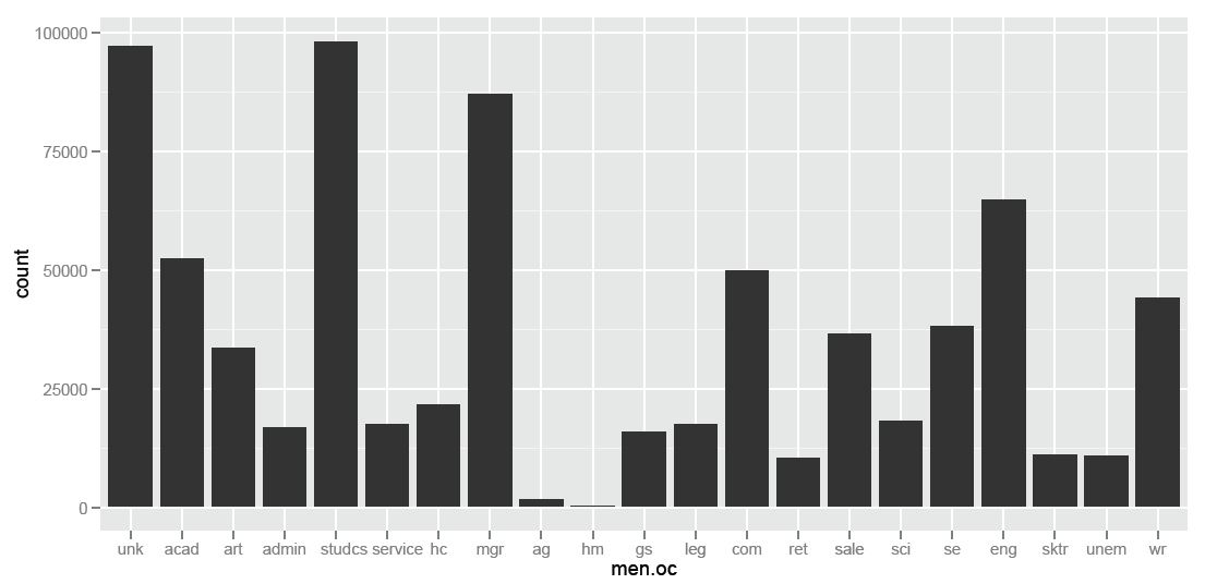
require(ggplot2)
#build subset of data (ml.fact.t is the original data frame, namedOC is a column vector with alpha occupation codes instead of numeric codes).
oc<- ggplot(ml.fact.t, aes(factor(namedOC)))
# build a bar chart
oc + geom_bar()
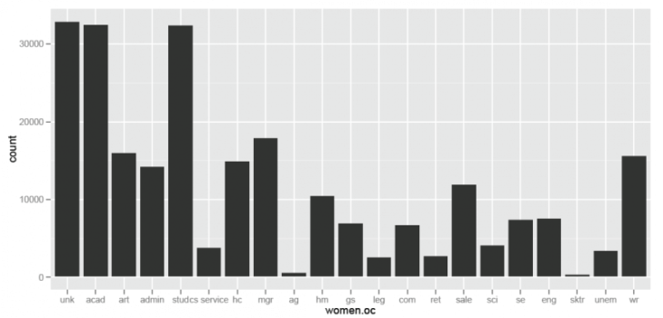
For just women:
#slice the data to include just women
women.oc = namedOC[GENDER=="F"]
# build the subset of data to use for the chart
w.oc<- ggplot(data=NULL, aes(women.oc))
#build a barchart
w.oc + geom_bar()
There are a surprising number of individuals who self-report as managers. As managers tend to have higher levels of disposable income, as a group they might be important to try to target.
A very quick histogram of managers by age produces the following chart. First pass visual inspection indicates that one of two things is happening here: either young managers disproportionately prefer Movielens (i.e., there is some age bias within the subset of managers), or there is some measurement error in self report – individuals who aren’t completely honest about their age or their occupation or both.
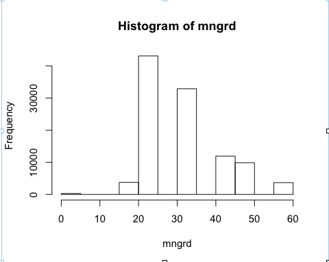
#pull the ages of just managers
mngrd = AGE[namedOC=="mgr"]
#make a quick histogram
hist(mngrd)
#examine by gender
table (mngr, GENDER)
If you want to market specifically to managers, you would want to know what sorts of movies they like.
This requires a little bit of math (which is all pretty easy in R). I pulled the total number of movies watched by managers from each genre. Using the total number of times managers picked this genre, and the subset of those that managers actually liked we get the percentage of movies actually liked.
It’s incredibly simple, but it’s also easy to talk about, to interpret, and to use as a starting point for more questions.
An auxiliary benefit of this type of quick and dirty look at the data gives us common sense checks for any recommender system that we come up with. At a high level, a recommender that isn’t suggesting managers in general watch action movies is probably needs a little tweak, or at least you should ask why.
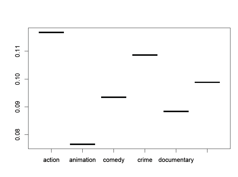
#make a plot (using lattice). I should note that I created a data frame with the names of the genres shown, the totals, total highly rated, and percents – which were previously calculated using basic arithmetic.
plot(factor(names), percent).
Two quick things. The first is that we have barely scratched the surface of visualization. The second is that the citation for the orginal article is given below. It’s totally worth a read.
Michael J Shaw, Chandrasekar Subramaniam, Gek Woo Tan, Michael E Welge, Knowledge management and data mining for marketing, Decision Support Systems, Volume 31, Issue 1, May 2001, Pages 127-137