
Explaining models built in H2O-3 — Part 1


Machine Learning explainability refers to understanding and interpreting the decisions and predictions made by a machine learning model. Explainability is crucial for ensuring the trustworthiness and transparency of machine learning models, particularly in high-stakes situations where the consequences of incorrect predictions can be significant.
Today, several techniques are available to improve the explainability of a machine learning model, such as visualising the model’s decision-making process and using techniques like feature importance analysis to understand the factors that most influence the model’s predictions. Some algorithms, like generalized linear models, decision trees, and generalized additive models, are designed to be inherently interpretable. For interpretable models, the explanations native to the model frequently prove to be the most useful. Other algorithms, like gradient-boosting trees and neural networks, are infamous for their black-box nature. In such cases, post- hoc techniques provide a way to explain the model’s predictions after it has been trained.
H2O-3 is a fully open-source, distributed, in-memory machine-learning platform with linear scalability. Apart from supporting the most widely used statistical and machine learning algorithms, it also has a dedicated toolkit for Model Explainability, making it easy to visualise and assess the predictions from the models. This blog post explains how to train a baseline gradient boosting machine (GBM) model in H2O-3 and then derive global and local explanations for the predictions. At the end of the article, you should understand how to generate, explain and interpret the results of machine learning models trained using H2O-3.
Model Explainability Interface in H2O-3

The model explainability interface in H2O-3 is a simple and automatic interface for several new and existing explainability methods and visualisations in H2O. Two main functions lie at the centre of the explanation process:
- The function h2o.explain() for global explanations and,
- h2o.explain_row() for local explanations.
These functions work for individual H2O models, a list of models, or an H2O AutoML object. The explainability function automatically generates a list of explanations in the form of plots depending upon :
- the nature of the problem — classification or regression,
- the nature of explanations — global or local
- the nature of the models — single or multiple
The following explanations are generated automatically for a list of models or an AutoML object:
- Leaderboard (compare all models)
- Confusion Matrix for Leader Model ( classification only)
- Residual Analysis for Leader Model ( regression only)
- Variable Importance of Top Base (non-Stacked) Model
- Variable Importance Heatmap (compare all non-Stacked models)
- Model Correlation Heatmap (compare all models)
- SHAP Summary of Top Tree-based Model (TreeSHAP)
- Partial Dependence (PD) Multi Plots (compare all models)
- Individual Conditional Expectation (ICE) Plots
The H2O–3 explanation interface uses ggplot2 and matplotlib, respectively, to work with Python and R.
Using the H2O-3 Explainability toolkit

In this section, we’ll train a baseline GBM model in H2O-3 using a preprocessed version of the lending club “bad loans” dataset. The Lending Club dataset is a collection of financial data related to loans issued by the Lending Club, a peer-to-peer lending company. This dataset is also available on Kaggle. We’ll train a model to predict whether or not a borrower will pay off the loan. H2O works with R, Python, and Scala on Hadoop/Yarn, Spark or your laptop; however, in this article, we’ll be working with Python.
Step 1: Setting up the environment.
We’ll start by installing the latest version of H2O-3.
!pip install h2o
H2O-3 can also be downloaded and installed from its official website. The next step is to set up the environment by importing the necessary libraries and initialising H2O by starting the H2O-3 server.
import numpy as np
# H2O-3 algorithms
import h2o
from h2o.estimators import H2OGradientBoostingEstimator
# global random seed for better reproducibility
SEED = 12345
h2o.init(max_mem_size='4G') # start h2o
h2o.remove_all() # remove any existing data structures from h2o
memory
h2o.no_progress() # turn off h2o progress indicators
Step 2: Loading the dataset
Next, you need to load the data. H2O-3 supports various data formats, including CSV, TSV, and Excel files. We’ll use the h2o.import_file() method to load the data into H2O-3 by specifying the file’s path, which in our case, is in an S3 bucket. To ensure the dataset is imported correctly, we’ll use the .head() function to display the first ten rows of your dataset
input_csv = "https://s3.amazonaws.com/data.h2o.ai/Machine-Learning-at-Scale/lending_club/loans.csv"
loans = h2o.import_file(input_csv)
loans.head()
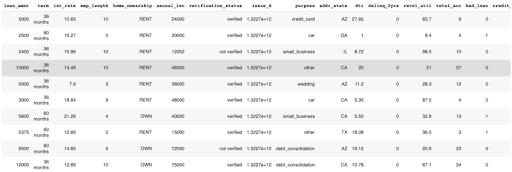
DataFrame shows the first ten rows of the dataset.
As indicated in the table above, the dataset consists of various predictor variables like loan amount, term, and interest rate, plus one target variable called bad_loan. The target variable is 1 if the loan was bad and 0 otherwise.
Step 3: Train a baseline GBM(Gradient Boosting Machine) model in H2O-3
Since we’ll train a binary classification model, it is important to ensure that the target column is encoded as a factor.
loans["bad_loan"] = loans["bad_loan"].asfactor()
Next, we’ll split the data into training, validation and test sets. It is crucial to split the data into training and test sets to evaluate the performance of the GBM model. We’ll use the h2o.split_frame() method to split the data into three sets, with a specified ratio of data for training, validation and testing.
train, valid, test = loans.split_frame([0.7, 0.15], seed=SEED)
Specifying the inputs (predictors) and outputs (response) columns.
target = "bad_loan"
ignore = ["bad_loan", "issue_d"]
predictors = list(set(train.names) - set(ignore))
Now that we have our train, valid, and test sets and our target and predictor variables defined, we can start training the model. It can be done by calling the model.train() method and passing the training data.
gbm = H2OGradientBoostingEstimator(seed = SEED)
gbm.train(
x = predictors,
y = target,
training_frame = train,
validation_frame = valid,
model_id = 'baseline_gbm')
H2O will give you a complete summary of your model. You will see your model’s metrics on the training and validation sets. We can see details about the model, including our model’s parameters and metrics, the confusion matrix, thresholds that maximize metrics such as F1, a Gains/Lift table, and the scoring history.
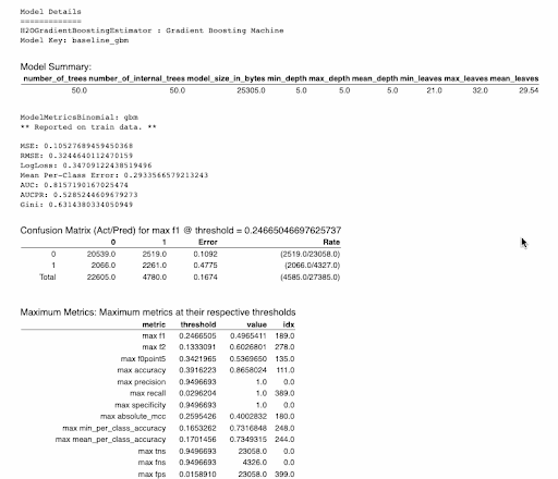
A summary of the model details, including your model’s parameters and metrics, the confusion matrix, thresholds that maximize certain metrics, a Gains/Lift table, and the scoring history.
After the GBM model has been trained, you can evaluate its performance by calling the model.model_performance() method and passing the held-out test data. This will return an object that contains various metrics, such as accuracy, AUC, and F1 score, that we can use to evaluate the model’s performance.
print(np.round(gbm.model_performance(train).auc(),2),
np.round(gbm.model_performance(valid).auc(),2),
np.round(gbm.model_performance(test).auc(),2))
-------------------------------------------------------------------
0.805 0.724 0.698
These findings demonstrate that our baseline model overfits the training data. While the focus of this article is to showcase the various explainability features of H2O-3, you are nevertheless encouraged to improve the test and validation AUCs. See the tuning a GBM for more information on the configurable parameters within the GBM module.
Explanations for single models

Once the model has been trained and evaluated on the held-out dataset and shows good performance, the next step in the ML pipeline is to understand how the predictions are made and which features the model relies on most to make those predictions. The H2O-3’s explainability interface can provide both global as well as local explanations for single and multiple models.
This article will only look at the explanations generated for single models. The multiple model scenario will be addressed in the second part of this article.
Global Explanations for single models
Global explanations refer to the ability of a model to provide explanations for its predictions at a global level rather than just for individual inputs. This means that the explanations provided by the model apply to the model as a whole rather than just to specific input examples. Global explanations can help understand the overall behaviour of a model and can help users gain confidence in the model’s predictions.
Global explanations in H2O-3 are generated as follows:
gbm.explain(test)
For our single GBM model, the above function generates and displays the following global explanations:
- Confusion Matrix
- Variable Importance plot
- SHAP summary plot
- Partial dependence plots(PDP)
Some additional parameters can also be specified, but they are optional. For the column-based explanations (e.g. PDP, ICE, SHAP), the columns are ranked by variable importance (wherever applicable), and the top N features are chosen for explainability where N defaults to 5.
Let’s understand each of them one by one.
Confusion Matrix
The confusion matrix shows a predicted class vs the actual class, tallying the number of test set instances with each combination of actual and predicted outcomes.
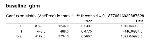
Confusion Matrix for the baseline GBM
Variable Importance plot
The variable importance plot shows the relative importance of the most important variables in the model.
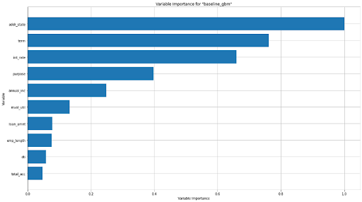
The Variable Importance plot for the baseline GBM
SHAP Summary Plot
SHAP (SHapley Additive exPlanations) provides a way to understand the contribution of each feature to the predicted outcome, accounting for the interactions and dependencies between features. The SHAP summary plot shows the contribution of the features for each instance (row of data). These plots provide an overview of which features are more important for the model. A SHAP summary plot is created by plotting the SHAP values of every feature for every sample in the dataset.
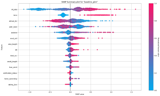
SHAP Summary Plot for the baseline GBM
The figure above depicts a summary plot where each point in the graph corresponds to a single row in the dataset. For every point:
- The y-axis on the left-hand side denotes the features in order of importance from top to bottom based on their Shapley values. The x-axis refers to the actual SHAP values.
- The horizontal location of a point represents the feature’s impact on the model’s prediction for that particular sample as measured by the local Shapley value contribution.
- The bar on the right-hand side shows the normalized feature values on a scale from 0 to 1, represented by color, with red indicating a higher value and blue indicating a lower value.
From the summary plot, we understand that ‘Interest Rate’ and ‘term’ have a higher total impact on predicting whether a person will default on the loan compared to other features. Also, people with higher interest rates and longer terms have a higher probability of defaulting than others.
Partial Dependence Plots
A partial dependence plot (PDP) gives a graphical depiction of the marginal effect of a variable on the predicted outcome. The effect of a variable is measured in terms of change in the mean response. The green lines or dots show the average response versus feature value with error bars. The grey histogram shows the number of instances for each range of feature values. For the interest rate plot on the bottom left, we can see that the average default rate increases with the interest rate, but also that the data becomes increasingly sparse for larger interest rates.
It is important to remember that PDPs do not consider any interactions or correlations with other features in the model. Therefore, it is important to consider other factors that may affect the prediction when interpreting a partial dependence plot. Below we can see the PDPs for the top of the most important variables in the model.
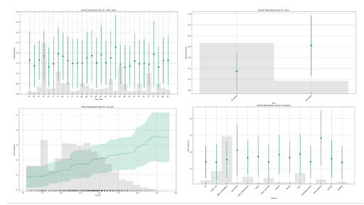
PDPs generated for the top 4 features ranked by variable importance
Individual plotting functions
While we used a single model.explain() function to output a series of plots, H2O-3 also provides various individual plotting functions that can be used inside the explain() function to output selected plots manually. For instance, an individual variable importance plot, partial dependence plot(for a single feature), SHAP summary plot and an ice plot can also be generated as follows:
gbm.varimp_plot()
gbm.shap_summary_plot(test)
gbm.pd_plot(test, column)
gbm.ice_plot(test, column)
Let’s talk a little more about the ICE plot.
- Individual Conditional Expectation (ICE) Plots
An Individual Conditional Expectation (ICE) plot is similar to a partial dependence plot (PDP) since both visualize the relationship between a predicted outcome and individual features in a dataset. The key difference between the two is that ICE plots show how the predicted outcome changes as the value of a particular feature changes while holding all other features constant. In contrast, partial dependence plots show how the average predicted outcome changes as the value of a particular feature changes while keeping all other features constant. In other words, PDP shows the average effect of a feature, while the ICE plot shows the effect for a single instance. In H2O-3, the ICE plot shows the effect for each decile.
gbm.ice_plot(test, column = 'int_rate')
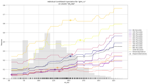
ICE Plot for the baseline GBM
The plot above shows both a PDP and an ICE plot for the interest rate feature. We can easily compare the estimated average behaviour with the local behaviour. When partial dependence and ICE curves diverge, it’s an indication that the PDPs may not be entirely trustworthy, or maybe there are correlations or interactions in input variables—something to watch out for before putting models into production.
Local Explanations for single models
In the preceding section, we looked in detail at the global explanations for single models. This section is dedicated to local explanations. Local explanations refer to the explanations provided at a local level for individual input examples. This means that such explanations apply only to a specific input rather than to the model as a whole. Local explanations can help understand why a model made a particular prediction for a specific input and can help users trust the model’s predictions on a case-by-case basis.
Local explanations for single models in H2O-3 can be generated as follows:
gbm.explain_row(test, row_index=50)
The following local explanations will be returned for the 50th row in the test:
- SHAP Contribution Plot (only for tree-based models)
- Individual Conditional Expectation (ICE) Plots
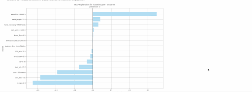
Local explanations for the 50th row of a single baseline GBM model
Conclusion
In this blog post, we have discussed the importance of explainability in machine learning and how H2O-3 makes it easy to explain the models via an easy-to-use interface. We used H2O-3’s dedicated toolkit for Model Explainability to visualize and assess a trained model’s predictions and derived global and local explanations. While this article was dedicated to understanding single models, we’ll explain the predictions for multiple models in the next part. We may encounter such scenarios when we are provided with a list of models or, in the case of AutoML output. The code notebook used in the article can be accessed here. Let us know if you have used the module for your use case in the comments section.