
Regression Metrics' Guide

Introduction
As part of my role within the automated machine learning space with H2O.AI and Driverless AI, I have seen that many times people struggle to find the right optimization metric for their data science problems. This process is even more challenging in regression problems where the errors are often not bounded like you normally have with probabilistic modeling. One would expect that a “good” model would be able to get superior results versus all metrics available, however quite often this is not the case. This is a misconception. Commonly at the beginning of the optimization process, it is true that most metrics tend to improve, however after a while they reach a point where improvement in one metric may result in deterioration for another. I have encountered this multiple times when observing Mean Absolute Error (MAE) and Mean Squared Error (MSE). When I select a MAE optimizer for my model, I can see that in the first iterations of my algorithm, both MSE and MAE become smaller/better, however, after a while, only MAE improves while MSE becomes worse. In other words, when optimizing for a model, you can maximize the gain via optimizing for the metric you are most interested in, otherwise, you might be getting suboptimal results.
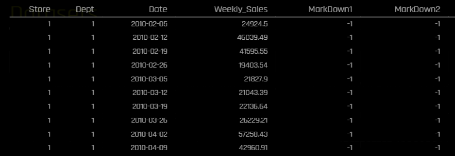
In this article, I will iterate through different common regression metrics and discuss some pros and cons for each metric as well as giving my personal recommendation for when it may be best to prefer one metric over another. For demonstration purposes, I would be using a subset of time series data from this Kaggle competition regarding sales forecasting. I would be predicting Weekly sales in different stores and departments for a retailer. The data spans for more than 140 weeks. I will be using the last 26 weeks for testing. I will be using H2O.ai’s Driverless A I to run my time-series experiments.This is the snapshot of the data:
The target’s distribution is right skewed with some fairly high values compared to the mean:

The overall descriptive of the target variable (Weekly_Sales) are the following:
| Name | Min | Mean | Max | std |
| Weekly_Sales | -4,988.940 | 20,415.910 | 406,988.630 | 19,475.064 |
Metrics
RMSE (or MSE)
The Root Mean Squared Error (RMSE) or Mean Squared Error (MSE, which is basically the same as RMSE without the squared root) is the most popular regression metric. If there was a king/queen of regression metrics, this would have been it! This is how it is computed:


These are the results we get in the test data for different metrics:
| Scorer | Final test scores |
| MAE | 2076.3 |
| MAPE | 24.196 |
| MER | 9.4783 |
| MSE | 1.3387e+07 |
| R2 | 0.95816 |
| RMSE | 3658.8 |
| RMSLE | nan |
| RMSPE | 17236 |
| SMAPE | 17.048 |
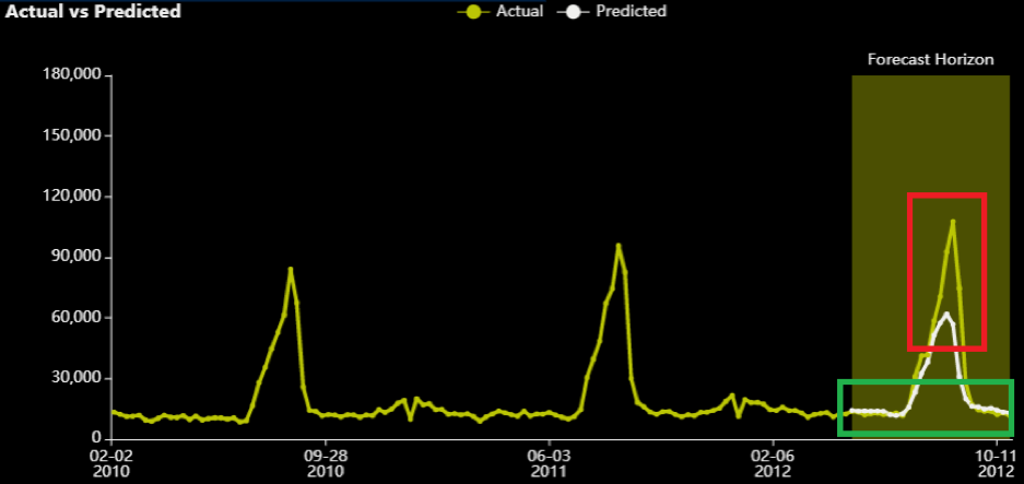
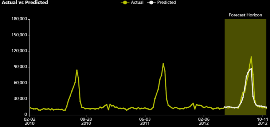
A model optimized for RMSE can get an error of 3,658. Considering that the mean of the target in the training data was at the level of 20,000, this seems like a decent error. We can look at individual time series (for specific combinations of stores and departments) and see what the predictions look like.
For department 3 and store 39, we can see the actual (yellow) versus predicted (white) for the 26 weeks in the test data.
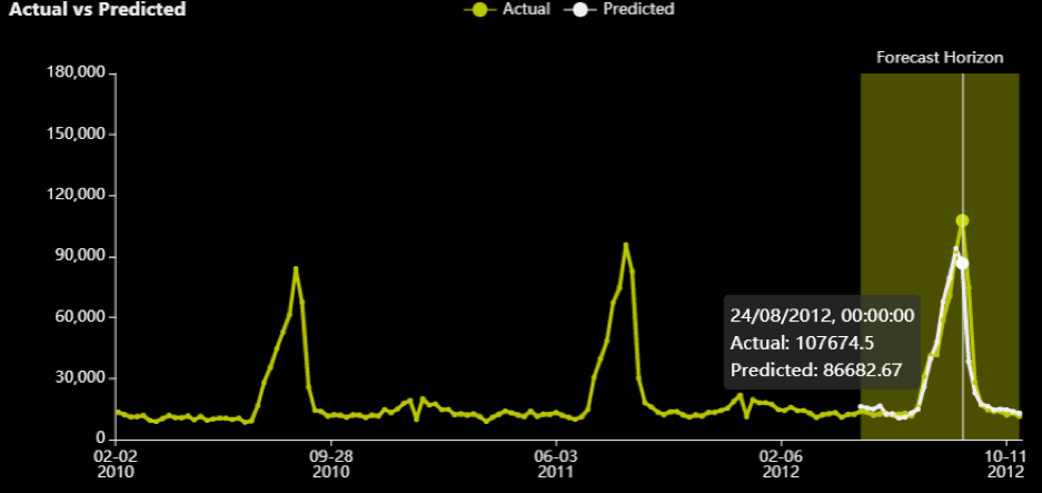
Note that there is a peak in August that also appears to be very seasonal/periodic as it has happened in every other year as well. The RMSE optimizer tried to close the gap for that prediction.
Moving on to the next metric.
MAE
The Mean Absolute Error (MAE) is also a popular regression metric. It is described as:
For each row, you subtract the prediction from the actual value and then take the absolute of that difference ensuring it is always a positive value. Then you just take the average of all these absolute differences.
A few attributes about this metric:
1) MAE is also popular and as a bit of trivia, there is a never-ending discussion for which metric is better, MAE or RMSE. Clearly, it depends on the use-case.
2) The smaller it is the better. It has to be >=0.
3) All errors are analogously weighted in this metric. An error of 2 is twice as worse than an error of 1.
4) It is vulnerable to outliers(but less than RMSE).
5) It is not as easily optimizable. MAE is not differentiable at zero (when predictions are equal to the actuals) and depending on the distribution of the target, this may make different approximations for MAE better than others.
6) Most well-known algorithms have a solver for MAE, however, these are not always optimal due to the difficulty in optimizing MAE. For instance, if you follow Kaggle, in a recentcompetition, an MSE optimizer for some algorithms was doing better at reducing MAE than the MAE optimizer.
When to use it:
This metric is ideal when all errors are analogously important based on their volumes. This is quite often the case in finance where a loss/error of 200$ is twice as worse than a loss of 100$. Logically this is most often the case, however, human beings can be anelastic (or elastic) in certain areas of the error, hence metrics like RMSE are also very popular.
Experiment
I ran an experiment with the same default parameters, selecting MAE as the scorer. These are the results:
| Scorer | Final test scores |
| GINI | 0.98558 |
| MAE | 1883.8 |
| MAPE | 17.182 |
| MER | 8.1498 |
| MSE | 1.3847e+07 |
| R2 | 0.95734 |
| RMSE | 3721.1 |
| RMSLE | nan |
| RMSPE | 6875.9 |
| SMAPE | 13.851 |
As can be seen, the MAE is now lower/better than in the previous experiment which optimized for RMSE (1,883 vs 2,076) and RMSE is higher/worse (3,721 vs 3,658.8). This should reinforce the statement made at the beginning of this article that a better model in one metric, does not guarantee better performance in all other metrics – which is why it is very critical to understand all available metrics and choose the right one for your business case.
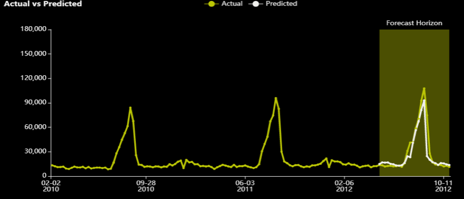
This is what the series for department 3 and store 39 looks like:
Although the predictions near the peak (which are highlighted with red) are “more off” than the ones from the equivalent RMSE experiment, the errors at the edges are smaller. The MAE optimizer “sacrifices” that peak to get the other (lower in volume) samples “more correct” (in absolute terms). Obviously, it does this for many stores and departments, but even from this graph, one can understand where each metric gives a higher intensity.
MAPE
Mean Absolute Percentage Error (MAPE): MAPE measures the size of the error in percentage terms (compared with the actual values). It is essentially MAE, but as a percentage, because each absolute error is divided by the (absolute) actuals.
This is probably the trickiest regression metric I have encountered. It gives me trouble most of the time I need to work with it. I think I might get a bit emotional describing this – I hope you don’t mind that!
Attributes about this metric:
1) It tends to be popular among business stakeholders. That is because it is easily comprehensible and/or consumable since it is represented as a percentage. E.g. “on average we get an error of x% from our model across all channels”.
2) The smaller it is the better. It should be noted that it can take values higher than 100%.
3) All % errors are analogously weighted. An error of 20% is twice as worse than an error of 10%
4) This error does not consider the volume/magnitude of the normal error. An error of 1,000$ where the actuals were 10,000 (e.g. 1,000$/10,000$ =10%) has the same contribution as an error of 1,000,000$ where the actuals were 10,000,000$ (e.g. 1,000,000$ /10,000,000$ =10%). On a different example, when the absolute error is 0.2$ and actual is 0.1$, the MAPE is 200%, 20 times higher than the above examples and will have 20 times more weight in the metric’s minimization. This also means that you could be reporting a smaller error, because you get all these small-volume cases close percentage-wise, while you are missing some with very high actual values by millions/billions. Every error becomes relative to the actuals.
5) The metric is not defined when the actuals are zero. There are different ways to handle this. For example, the zero actuals could be removed from the calculation or a constant could be added. Any treatment applied when the actuals are zero has its own shortcomings, hence this metric is not recommended in problems with many zeros. The Symmetric Mean Absolute Percentage Error (SMAPE) that we will examine later might be more suitable when there are many zeros. Another alternative would be to use theWeighted Absolute Percent Error (WAPE) formula. This is basically the same as MAPE, with the difference that first all the errors and all the actuals are summed and then you calculate the fraction of sum of absolute errors versus the sum of all the actuals. That way, it is quite unlikely that the actuals will be close to zero (depending on the problem of course), however your model may lose some of its capacity to capture the target’s variability as it no longer focuses on individual errors and can easily ignore predictions that are “very off” since they no longer have a huge impact on the overall metric. In other words, it can be a bit too insensitive to the target’s fluctuations.
6) It is not vulnerable to outliers in the same sense that RMSE and MAE are. That is one or two high errors that may not be enough to cause this metric to “go berserk”(!), especially if the actuals are very high too, however, problems can arise from the overall distribution of the target (see next point).
7) Big range and standard deviation with many zeros (or low values in general) in the target variable with cases that may not be easily predicted can cause this metric to explode from small percentages to huge numbers. I have often (sadly) seen MAPEs of 1000000000% (no kidding!). A difficult use case would be estimating daily stock market profit/losses for a portfolio (assuming a high budget). One day you may be winning 3 cents (0.03$), the next day 200,000$ and the day after that you lose 10,000 (which won’t happen easily if you use our tools, because our algorithms will anticipate it ![]()
![]() ). Now imagine predicting 100,0000$ for the next day (which is a perfectly plausible number based on historical values) and you end up making 1 cent. The MAPE for that case will be 999999.99$/0.01 = 9,999,999,900%! In these situations, a high range of possible values and unpredictable spikes in your target can cause MAPE to go completely “off”. Also, this will most likely halt MAPE’s optimization and force it to take some constant value. The best remedy I have seen in these situations is adding a constant value to your target in all samples, which needs to be sufficiently large to account for the possible range of values you could get. I treat this constant value as a hyper parameter for a given experiment. Putting this too high will damage your model’s ability to capture much of the variation within your target. Putting this too low will still give you abysmally high MAPEs. You need to run different experiments to find the value hat works best and remember to subtract that constant again after making predictions.
). Now imagine predicting 100,0000$ for the next day (which is a perfectly plausible number based on historical values) and you end up making 1 cent. The MAPE for that case will be 999999.99$/0.01 = 9,999,999,900%! In these situations, a high range of possible values and unpredictable spikes in your target can cause MAPE to go completely “off”. Also, this will most likely halt MAPE’s optimization and force it to take some constant value. The best remedy I have seen in these situations is adding a constant value to your target in all samples, which needs to be sufficiently large to account for the possible range of values you could get. I treat this constant value as a hyper parameter for a given experiment. Putting this too high will damage your model’s ability to capture much of the variation within your target. Putting this too low will still give you abysmally high MAPEs. You need to run different experiments to find the value hat works best and remember to subtract that constant again after making predictions.
8) Not easily optimizable either.
9) Some packages have an optimizer for it. For example Tensorflow/Keras, lightgbm do. Bear in mind, there is no guarantee that these will always work – MAPE can be hard to optimize and may need a lot of tuning of the other hyper parameters of these models as well to make it work well.
Experiment
I ran an experiment with the same default parameters, selecting MAPE. These are the results:
| Scorer | Final test scores |
| GINI | 0.98218 |
| MAE | 1998.4 |
| MAPE | 16.776 |
| MER | 8.4729 |
| MSE | 1.4536e+07 |
| R2 | 0.9538 |
| RMSE | 3812.6 |
| RMSLE | nan |
| RMSPE | 6172.8 |
| SMAPE | 13.948 |
Note that the MAPE of 16.77% is the lowest encountered so far. MAE of 1998.4 is worse than one of the MAE’s experiments (of 1,883) and the RMSE of 3812.6 is worse than the one of the RMSE’s experiments (of 3658.8). Once again, optimizing for MAPE, make MAPE better, but the rest of the metrics become worse compared to the experiments that optimized directly for them. Looking at the remaining of the metrics as well as from experience, the MAPE optimizer’s results should be closer to that of MAE’s.
This is not very clear from the graph for department 3 and store 39:
What stands out about the graph is that there is almost never a zero error. The prediction line almost never touches the actual, albeit comes close to it. The previous two optimizers (RMSE and MAE) had cases where the error was zero (or very close to it). It does as well as RMSE on that peak though.
One last example before I move onto the next section. The test dataset I am scoring has 16,280 rows (e.g. 16.3K different combinations of stores and departments). We saw that the MAPE was at 16.77%. The actual value for Store 10 and department 2 on 03/08/2012 was 113,930.5 and Driverless AI predicted 112,740.76. The MAPE for that row is 1.04%. If we assume on that day, there were many returns (which constitutes a negative target) and/or the department was closed and the actual target was 0.01, then the MAPE for that row becomes 1,127,407,600%. The overall MAPE for all the rows now becomes 69,767.00%! That single bad prediction against the low actual target imposes a huge weight in MAPE’s calculation and will make you believe that the overall model is very (VERY) bad.
When to use it:
This metric is ideal when your target variable does not include a very big range of values and the standard deviation remains small. Ideally, the target would take positive values that would be far away from zeros with no unpredictable spikes or sudden ups or downs in its distribution. It is also useful when you want to easily explain the error in percentage terms and business stakeholders tend to like it.
SMAPE
The Symmetric Mean Absolute Percentage Error (SMAPE) can be a good alternative to MAPE. It is defined by:
Unlike the MAPE, which divides the absolute errors by the absolute actual values, the SMAPE divides by the mean of the absolute actual AND the absolute predicted values. This counters MAPE’s deficiency for when the actual values can be 0 or near 0. I will not be spending too much time in this metric as it is rarely selected.
Attributes about this metric:
1) Not as popular as MAPE. People would still prefer MAPE even though it has its shortcomings and struggles to make it work instead of switching to SMAPE. To be fair, SMAPE is not without its shortcomings either!
2) The smaller it is the better. Note that because SMAPE includes both the actual and the predicted values, the SMAPE value can never be greater than 200%.
3) It is NOT vulnerable to outliers.At worst a high actual compared to the predictions or a high prediction compared to the actual will be capped at 200%.
4) Might become too insensitive to the targets’ fluctuations. It is like a special MAPE case where a constant is added as explained in point 7 of MAPE’s attributes. Via always adding the prediction to the denominator, it can make the optimizer become too “relaxed” and not put much intensity to capture much of the variation within your target.
5) Not easily optimizable. For example, it is not differentiable when prediction and actuals are zero.
6) There are not many direct optimizers for metric this is well-known packages. I don’t know any to be honest. What has been somewhat efficient was to apply natural logarithm +1 transformation on MAE or MAPE which has a similar effect on reducing the impact of very high actuals. You may find this discussion on a Kaggle competition somewhat interesting on the topic. So, in practice, you use these (or other) target transformations as hyper parameters to tune against this metric.
When to use it:
When you cannot make MAPE to work properly and give you sensible values, but you want to still showcase a metric that can be interpreted as a % and make it more consumable and simpler to understand.
R2(R-squared)
R squared is quite likely the first metric you come across when you start learning about linear regression and evaluation/assessment metrics for it.
Calculating the R2value for linear a model is mathematically equivalent to:
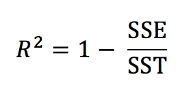
Breaking down the elements of the formula:
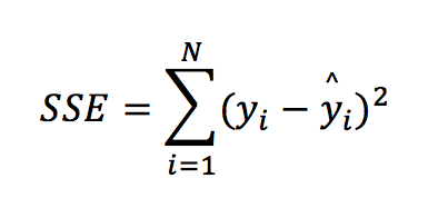
In other words, SSE (also called the residual sum of squares) is the squared error (without the mean and the squared root) from the RMSE formula.
SST (or the total sum of squares) can be defined as:
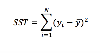
Where y– is the mean of the target.
Going back to the R-squared formula, we essentially compare/divide the error of our model with the error produced by a very basic model that just uses the mean of the target as its only prediction. Hence this metric shows you how better is the model from a naïve or very simple prediction. In some cases, this formula can produce a negative value (if the model is essentially worse than just using the mean of the target).
Attributes about this metric:
1) It is very popular, it could challenge MSE in fame and is very closely related to it.
2) The higher it is, the better the model. It takes values from minus infinity to +1.
3) It makes a comparison between models easier and consistent. Consider RMSE for instance and an error of 5. “I get an error…of 5”! This does not mean anything without context. If you are predicting the daily temperature in Fahrenheit then it does sound like a decent error to have. If you are predicting the number of children a couple is going to have, then an error of +-5 does not sound very inspiring. So, on average you missed the count of expected children by 5! No wheel was invented here, a naïve model would probably do better! However, because this metric always compares the model’s performance against a basic prediction, it scales to a range of values that can be compared across models. As a rule of thumb, you could use the following table to understand how good your model is based on R2. Such a table can never be produced to compare different models in other metrics without context:
| R-squared | Assessment |
| <0.0 | Worse than just using the average of the target |
| <0.1 | Weak |
| <0.2 | Fairly weak |
| <0.3 | Weak to Medium |
| <0.5 | Medium |
| <0.7 | Medium to Strong |
| <0.9 | Strong |
| >0.9 | Superb! |
Bear in mind that even a weak model can be useful. This is where is fit to say that “all models are wrong but some are useful”. Sometimes a prediction that is slightly better than the average is still good enough to be useful. For example, trying to estimate the wind speed for the next 3 hours based on recent weather attributes, even a slightly better prediction than the average wind experienced in the previous x hours can be life-saving for whether airplanes should take-off. In practice we do get significantly better predictions than the average in predicting weather conditions, so don’t get too worried about it!
Conversely, a very high R-squared might not be good enough to be useful. For example, a marketing company has a deal that allows it to pay a fixed amount of 1,000$ to a mailing company and send 100,000 mails every day to different people advertising its products. Out of these 100,000 mails, the company generates 10,000$ income from people that buy the advertised products. Let’s assume that most of the income comes from a small proportion of the people contacted via mail. The company could save some money via opting for a different mailing package that only sends 10,000 with a fixed amount of 500$ (which smaller than the current amount of 1,000$ it pays for the 100,000 mails). The company decided to build a model that predicts the expected total income generated from a subset of 100,000 people, with the scope of keeping the 10,000 with the highest predictions that would allow it to opt-in for the cheaper mailing package and save some money. It builds a model with a very high R-squared (i.e. 0.9) in predicting expected revenue by a person. Within the 10,000 cases with the highest expected/predicted income It can accumulate 90% (or 9,000$ out of 10,000$) of the total income that it would have received if it had contacted all the 100,000 people. This sounds like a very strong prediction (albeit not perfect). However, the 10% of the income that is now missing (which is 1,000$ ) and resides within the 90,000 of the people that won’t get contacted with the new package is higher than the cost it saves from switching packages (which could be 1,000$-500$=500$). In this case, this strong model is not good enough to give the company profit and therefore is not useful.
4) It does not really tell you much about what the average error is. As stated previously it is a measure that tells you how better the model is than a very basic model. Hence it is advisable to track this metric along with RMSE, MAE or another measure that can also give you an estimate for the error too.
5) It is counter-intuitive for its scaling ability that it can take infinitely negative values.
6) It is optimizable using MSE or RMSE solvers.
7) Most tools/packages have an optimizer for it
When to use it:
When you want to get an idea about how good your model is against a baseline that uses only the mean of the target as a prediction. Ideally, it should be accompanied by another metric that measures the error in some form. It helps to compare/rank models’ performances that could be predicted very different things.
R-squared as Pearson’s Correlation Coefficient
In order to avoid the infinitely negative values R-squared could take which may beat the purpose for using R-squared (and its ability to scale and compare models), within Driverless AI R-squared is computed via squaring thePearson Correlation Coefficient. In the case of an MSE linear regression optimizer, the results should be the same as with the formula from the previous section. With other types of models R-squared could differ from this formula.
In this form, the R-squared value represents the degree that the predicted value and the actual value move in unison. The R-squared in this state varies between 0 and 1 where 0 represents no (linear) correlation between the predicted and actual value and 1 represents complete correlation. However, a disadvantage of this method (which is generally greatly minimized via using internally MSE optimizers) is that this implementation ignores the error completely in its calculation. It primarily “cares” for making predictions as analogous to the actuals as possible, ignoring the volumes. For example, these 2 models have the same R-squared.
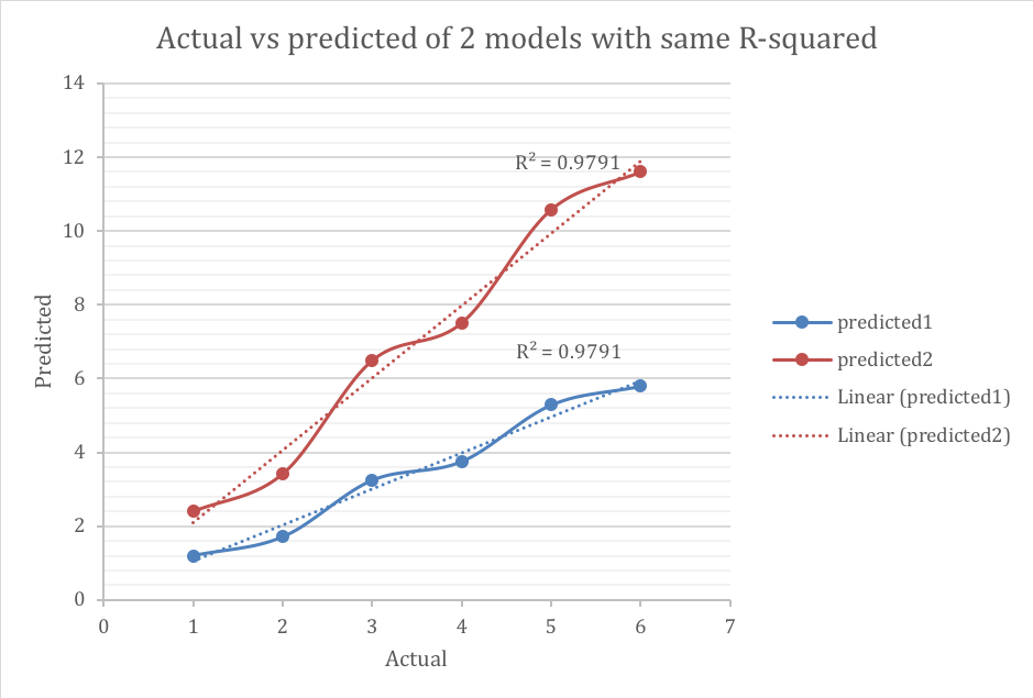
The blue line has much smaller error, however both models have similar ability to anticipate changes on how the target moves. As stated before, this drawback is alleviated when R-squared is minimized using MSE-based solvers.
Experiment
The R-squared experiment yielded the following results:
| Scorer | Final test scores |
| GINI | 0.9867 |
| MAE | 1898 |
| MAPE | 23.193 |
| MER | 8.2822 |
| MSE | 1.1824e+07 |
| R2 | 0.96271 |
| RMSE | 3438.5 |
| RMSLE | nan |
| RMSPE | 15894 |
| SMAPE | 15.666 |
The R2of 0.96271 is the highest reported among all other experiments and the actual versus predicted look a lot like the MAPE’s experiment
RMSLE
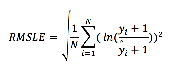
This metric was always “nan” in all previous experiments and for a good reason as the dataset contains negative values in the target variable. The Root Mean Squared Logarithmic Error (RMSLE) measures the ratio between actual values and predicted values and takes the log (plus 1) of the predictions and actual values. The formula is defined by:
It can also be written as:
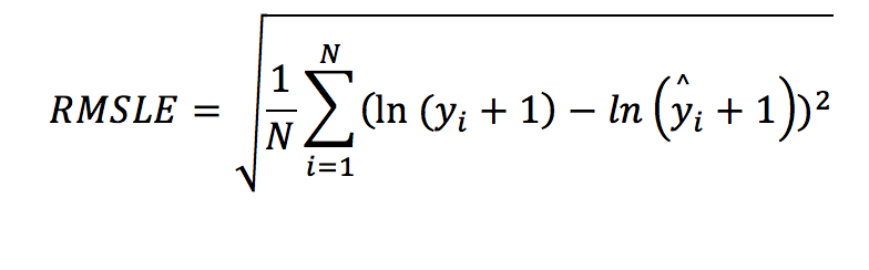
This is essentially the RMSE formula with the difference that the actual and the predicted values are transformed using the natural logarithm. The “plus one” element helps to include cases where the target is zero. The natural logarithm of zero cannot be defined, hence we add one. Why would applying the natural logarithm be useful?
The following time series example demonstrates counts of visitors in a village. During Autumn months there is a famous festival and the number of visitors increases exponentially.
| Date | Actual |
| Jan-19 | 1 |
| Feb-19 | 2 |
| Mar-19 | 1 |
| Apr-19 | 3 |
| May-19 | 4 |
| Jun-19 | 1 |
| Jul-19 | 3 |
| Aug-19 | 8 |
| Sep-19 | 10 |
| Oct-19 | 100 |
| Nov-19 | 1000 |
The counts in November and/or October may have a huge effect when building a model. The following graph show you how big the impact may be.

However, after applying natural logarithm plus one, the following table and graph become as follows:
| date | log(actual+1) |
| Jan-19 | 0.69 |
| Feb-19 | 1.10 |
| Mar-19 | 0.69 |
| Apr-19 | 1.39 |
| May-19 | 1.61 |
| Jun-19 | 0.69 |
| Jul-19 | 1.39 |
| Aug-19 | 2.20 |
| Sep-19 | 2.40 |
| Oct-19 | 4.62 |
| Nov-19 | 6.91 |
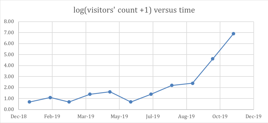
The natural logarithm helps to bring the target values somewhat in the same (or a closer) level. In other words, this transformation penalizes harder the very big values and alleviates RMSE’s impact on these outliers (that are likely to impose/cause higher errors).
Attributes about this metric:
1) It is quite popular, especially in pricing and in cases where the target is positive.
2) The smaller it is, the better.
3) It puts heavier weight on the bigger errors after applying the logarithmic transformation;however, this transformation is already alleviating the potential of likely higher errors, hence the overall weighting is more balanced.
4) It is not vulnerable to outliers. Large errors are not as likely to occur because of the logarithm transformation – it almost puts a cap on high values.
5) It does not work with negative values in the target variable. The remedy is to add a constant. A quick fix is to add the smallest value encountered in the target plus one. However, there might be better optimal constants. Finding the right constant is a hyper parameter. See also attribute (7) for MAPE as similar logic applies for RMSLE’s best constant.
6) Like SMAPE, it might become too insensitive on the targets’ fluctuations because of the heavy penalization of higher values.
7) It is easily optimizable. In most cases you apply the natural logarithm on the target first and then use an RMSE optimizer
8) Some algorithms have an optimiser for it, but it is not necessary, because as explained in (7) you could manually apply the logarithm transformation on the target and solve using RMSE.
When to use it:
This metric is ideal when you have mostly positive values with a few outliers (or high values) that you are not so interested in predicting well and MAE (as well as RMSE) seem to be critically affected by them.
Other metrics
For additional references, you may have a read in Driverless AI metrics’ outline. Also, I found the following article (that comes in 2 parts) well-written around the same topic and it could be useful to have a read as well. This is part 1 and part 2.
There were a few metrics that were not covered, but you can find the info in the links above. Giniis better to be analysed in the context of probabilistic modelling (and classification problems) in another article.
RMSPE(or Root Mean Square Percentage Error) is a hybrid between and RMSE and MAPE
MER(OR Median Error Rate) the same as MAE with the difference that instead of average we take the median.
Conclusion
There is no perfect metric. Every metric has pros and cons. A model that gives better results in one metric is not guaranteed to give you better results in every other metric. Knowing the strengths and weaknesses of each metric can help the decision-maker find the one which is most suitable for his/her use case and optimize for that. This knowledge can also help counter drawbacks that may arise from using a specific metric and can facilitate better model-making.