
Visualizing Large Datasets with H2O-3
Exploratory data analysis is one of the essential parts of any data processing pipeline. However, when the magnitude of data is high, these visualizations become vague. If we were to plot millions of data points, it would become impossible to discern individual data points from each other. The visualized output in such a case is pleasing to the eyes but offers no statistical benefit to the analyst. Researchers have devised several methods to tame massive datasets for better analysis. This short article will look at how the H2O library can aggregate massive datasets that can then be visualized with ease.
Objective
H2O is a fully open-source, distributed in-memory machine learning platform with both Python and R clients. H2O supports most of the leading and widely used machine learning algorithms . We’ll be using a publicly available airline dataset to demonstrate our point. It is a huge dataset with over 5 million records and is ideal for this visualization use case.
Prerequisites
Before you proceed further, make sure you have the latest version of H2O installed on your system. Detailed instructions about installing the library can be found in the Downloading & Installing section of the documentation.
Visualizing Large Data
Let’s now see how we utilize H2O to visualize a large dataset.
 . Initialize an H2O cluster
H2O has an R and Python interface along with a web GUI called Flow. In this article, however, we’ll use the Python interface of H2O. Every new session begins by initializing a connection between the python client and the H2O cluster.
A cluster is a group of H2O nodes that work together; when a job is submitted to a cluster, all the nodes in the cluster work on a job portion.
To check if everything is in place, open your Jupyter Notebooks and type in the following:
% matplotlib inline
import matplotlib.pyplot as plt
plt.style.use('fivethirtyeight')import h2o
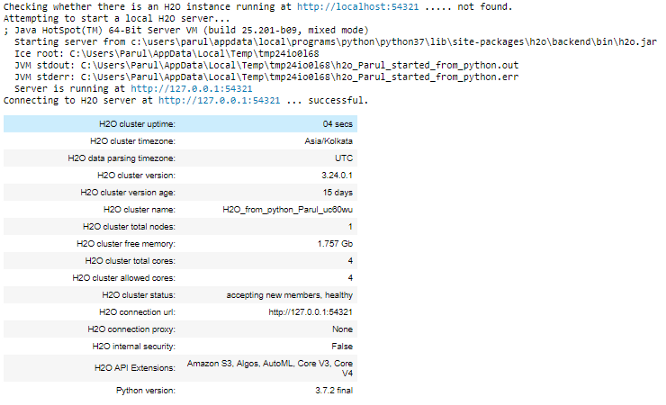
h2o.init()This is a local H2O cluster. On executing the cell, some information will be printed on the screen in a tabular format displaying, amongst other things, the number of nodes, total memory, Python version, etc.
 . A first look at data
Next, we will import the airline dataset and perform a quick exploration.
path = "https://s3.amazonaws.com/h2o-public-test-data/bigdata/laptop/airlines_all.05p.csv"
airlines = h2o.import_file(path=path)
Let’s check the first ten rows of the dataset.
airlines.head()
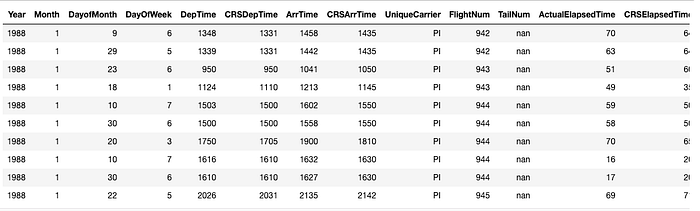
What we have above is called an H2O Frame. It is similar to Pandas’ dataframe or R’s data.frame. One of the critical distinctions is that the
data is not held in Python/R memory. Instead, it is located on an H2O cluster (Java), and thus H2OFrame represents a mere handle to that data.
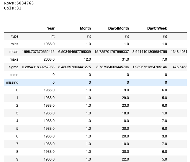
We can also take a look at a quick statistical summary of our dataset with the .describe() command as shown below:
airlines.describe
 . Visualising data
The dataset has around five million rows and thirty-one columns. Let’s now quickly plot a histogram of the Year column to see if there is a pattern in the data.
%matplotlib inline
airlines["Year"].hist()
Interestingly, the histogram shows that we do not have data for some years. This is the power that EDA brings to analysis. It helps to quickly pinpoint anomalies in datasets like missing values, outliers, etc.
Next, let’s plot the Departure versus the Arrival time to see if there is a relation between the two. This time we’ll plot a scatterplot so that we can see individual points.
# Convert H2O Frame into Pandas dataframe for plotting with matplotlib
airlines_pd = airlines.as_data_frame(use_pandas = True)plt.scatter(airlines_pd.DepTime, airlines_pd.ArrTime)
plt.xlabel("Departure Time")
plt.ylabel("Arrival Time")
Scatterplot of Departure versus the Arrival time | Image by Author
As stated above, we do get a scatterplot, but the individual points are hardly discernable. A lot of overlapping points make it difficult to see a general trend in the data.
H2O-3’s Aggregator method to the rescue
Merely looking at the entire data doesn’t make much sense. We could instead investigate a portion of the data provided it reflects the properties of the complete dataset. This is where H2O-3’s Aggregator method comes into the picture. The H2O Aggregator method is a clustering-based method for reducing a numerical/categorical dataset into a dataset with fewer rows.
“The Aggregator method behaves just like any other unsupervised model. You can ignore columns, which will then be dropped for distance computation.”
The output of the aggregation is a new aggregated frame that can be accessed in R and Python.
Why can’t we use random sampling instead?
This method is preferred over random sampling because the aggregator will maintain the shape of the data. Random sampling often causes outliers to be accidentally removed.
Reduce the Size of the Data using H2O-3’s Aggregator
Let’s now reduce the size of the data to 1000 data points. We will first create an aggregated frame with around 1000 records and then create a new data frame using this aggregated frame.
from h2o.estimators.aggregator import H2OAggregatorEstimator

# Build an aggregated frame with around 1000 records
agg_frame = H2OAggregatorEstimator(target_num_exemplars = 1000)
agg_frame.train(training_frame=airlines)

# Use the aggregated model to create a new dataframe using aggregated_frame
small_airlines_data = agg_frame.aggregated_frame
Let us view the dimensions of the new data frame:
small_airlines_data.dim[979, 32]Indeed, we have about 1000 data points now, but we have an extra column too. If you notice, the columns count increased by one. Let’s look at all the columns of the new data frame.
small_airlines.head()
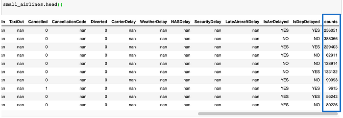
As mentioned above, a new count column is created. Aggregator maintains outliers as outliers but lumps together dense clusters into exemplars with an attached count column showing the member points.
Visualizing the reduced data frame
Let’s now visualize the new data frame. We’ll create the same scatterplot as we did above as a way to compare the two.
small_airlines_pd = small_airlines.as_data_frame(use_pandas = True)
plt.scatter(small_airlines_pd.DepTime, small_airlines_pd.ArrTime)
plt.xlabel("DepTime")
plt.ylabel("ArrTime")
Scatterplot of Departure versus the Arrival time — Reduced dataframe| Image by Author
As expected, this step takes much less time and outputs distinct data points readily discernible by the human eye.
Shutting down the cluster
Once you are done with the experiment, remember to shut down the cluster using the command below.
h2o.cluster().shutdown()
Conclusion
In this article, we looked at a way of using the H2O Aggregator method to reduce a numerical/categorical dataset into a dataset with fewer rows. The usefulness is evident in situations like above, where we need to visualize big datasets. if you are interested in digging deeper, the paper — Wilkinson, Leland. “Visualizing Outliers.” (2016) – will surely interest you. This paper presents a new algorithm for detecting multidimensional outliers and will help you understand the functioning of the Aggregator method.
Acknowledgment
Thanks to Megan Kurka , Senior Customer Data Scientist at H2O.ai, for creating the code for the article.
This article was originally published here .