
1st Place Winner's Blog - Kaggle 2021 Data Science and Machine Learning Survey


Kaggle, the largest global community of data scientists, conducted the 5th annual industry-wide survey that presented a truly comprehensive view of the state of data science and machine learning. A total of 25,973 responses were collected from participants from over 60 countries. Kaggle also launched the Data Science Survey Challenge in which the goal was to present a rich story about the data science and machine learning community.
I have always been interested in the analytics competitions on Kaggle, having won 4 different analytics competitions in the past, I decided to dig deeper into this competition as well. I got the opportunity to team up with my colleague, a good friend, and another Kaggle Grandmaster: Kunhao Yeh. We participated as Team H2O (Shivam Bansal and Kunhao Yeh) and developed a comprehensive analytics submission on the topic – data science adoption in 2021.
The whole effort and time spent on this competition were amazing. We were delighted to note that our team was selected as the winner of the competition.
In this blog, we have highlighted our story of why we choose this topic, how we curated our solution and finally a few tips on effective storytelling with data.
Motivation: Data Science Adoption (Maturity) in 2021
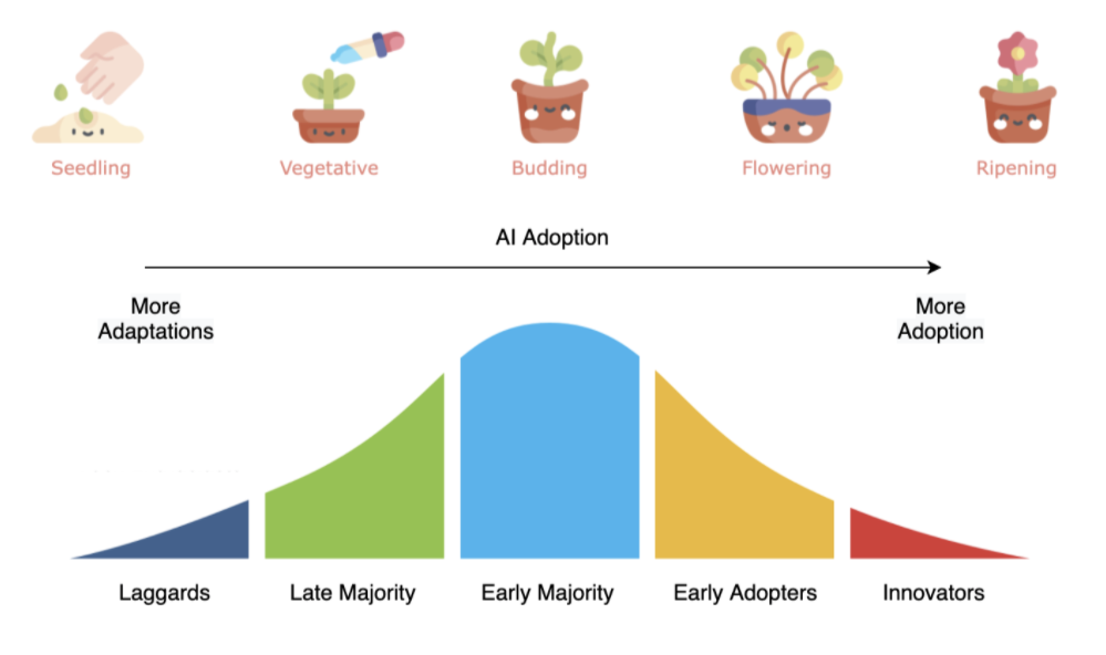
As part of our regular job as customer-facing data scientists, we interact with several organizations across different countries and industries. This involves companies of varying sizes, different revenues, and different data maturity levels. Some are at a very early stage and some are highly advanced. A common observation is that “many organizations are still at very early stages in their AI adoption”. If we have to categorize them in different groups, it can be analogous to stages of plant growth:
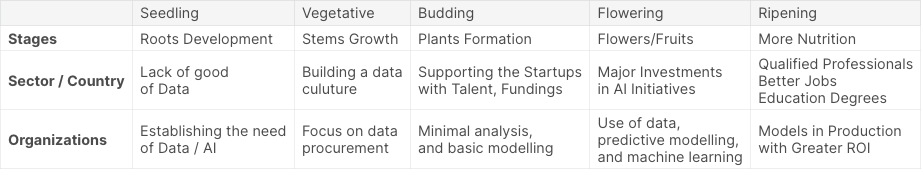
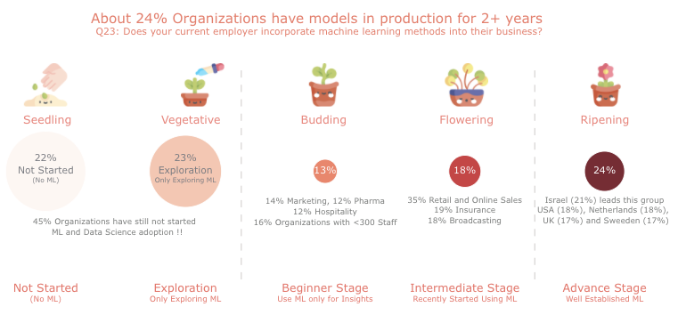
Seedling → Vegetative → Budding → Flowering → Ripening
Our Approach
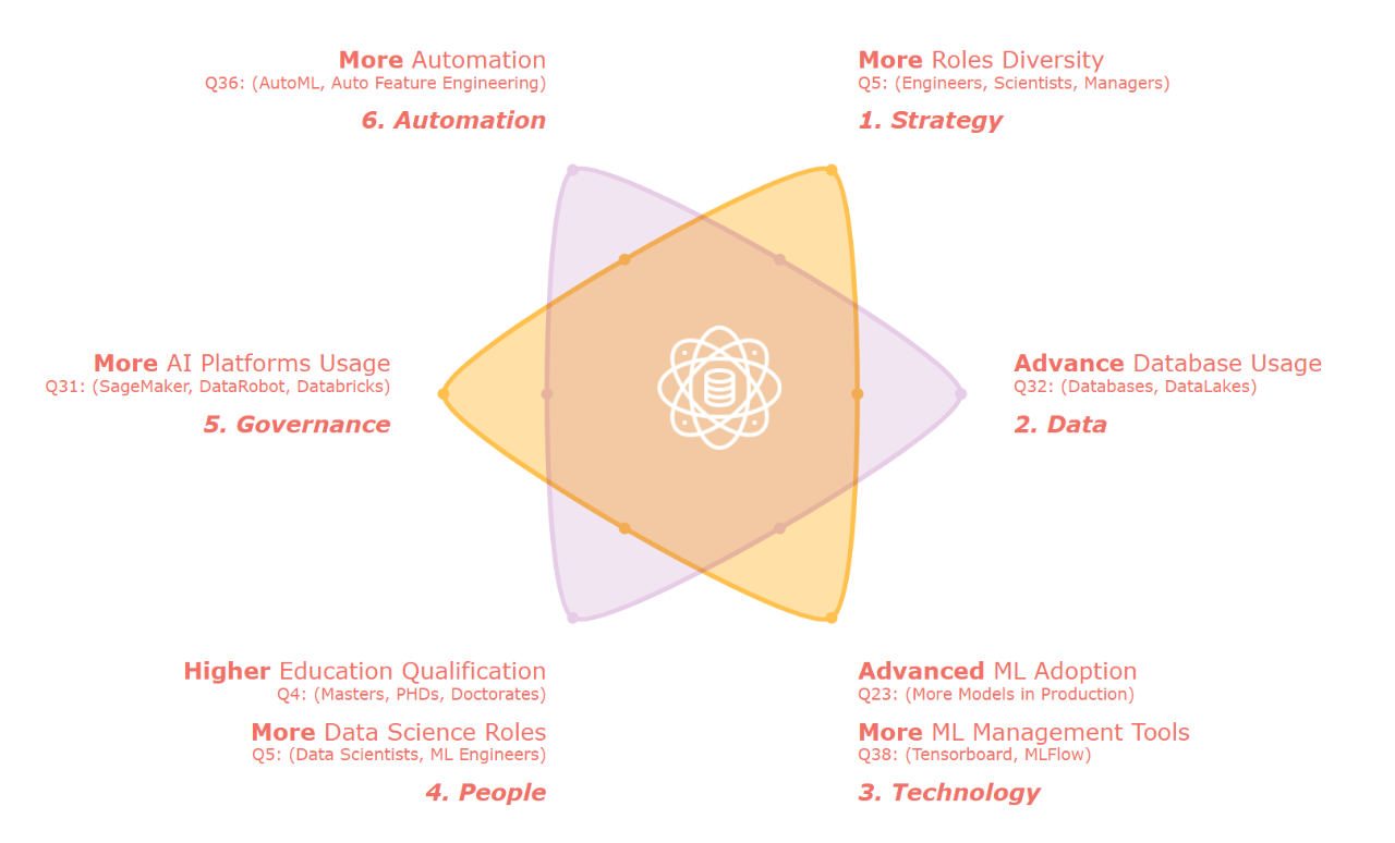
We aggregated the survey dataset by regions and industries. We then measured the mean, count, diversity among the following: education qualifications, job roles, data science techniques, cloud usage, machine learning platforms usage, data team size, incorporation of machine learning by employers, coding and machine learning experiences, big data tools, auto ml tools, etc. Using the aggregated information, we defined a unified data science adoption index that reflects the current state of maturity levels. We used the simple mean aggregation to derive the adoption index. We then visualized the adoption index, current machine learning incorporation levels by various internal and external data attributes such as – Global innovation index, competitive data science rankings, Industry revenues, job postings by countries, etc. This analysis helped us to identify which groups are leading while which ones are lagging.
To make sure that our methodology, insights, and findings are aligned with industry trends, we manually cross-checked a number of online references. This includes online reports, articles, and surveys published by organizations such as IBM, Mckinsey, Stanford, World Intellectual Property Organization, Element AI, etc. For the visualizations part, We developed a common visualization theme of the plots – HotSpot charts (bubble charts with hotness as the color theme), where something higher in quantity is colored as hot (red), and something lesser is colored as cold (blue). We selected the seed-plant growth stages analogy to reflect different stages of adoption levels.
Based on multiple components that we derived, we quantified an AI Adoption Index based on the following methodology:
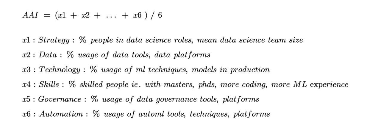
Our intention for choosing the theme of AI adoption was to understand the current maturity levels of the data science field across industries, sectors, and regions. The chosen theme and the richness of datasets motivated us to create a unified measure (index) that quantifies the state of AI/data science maturity/adoption. This type of index is analogous to the growth stages in plants, where a plant matures through different stages in its lifetime. This can also be measured by the ‘hotness’ of something, which means something popular has more hotness and something not popular has less hotness. These reasons inspired us to create a HotSpot chart that measures “hotness” by color and shows different stages of plants to reflect the current stage.
Key Elements of Our Solution
Data Science Adoption / Maturity in 2021 :Overall state of AI / ML adoption by the organizations. We noted that about 1/4th of organizations have matured state of AI / ML, a clear indicator for this insight was the question asked to organizations – if they have put models in production.
Other Insights:
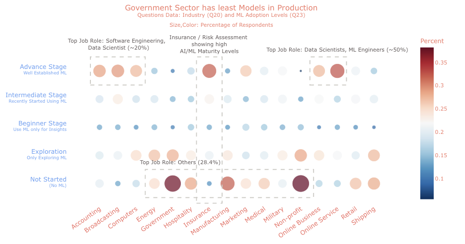
- 35% from Retail, Online Services, and Insurance sectors have well-established data science
- 2 out of 5 respondents from Governments or Public Services shared that they have not even started any machine learning or data science
- Insurance Industry: 1/3rd participants suggested that their current ML landscape are advanced (more models in the production)
- Online Services / Internet-Based Businesses have a significantly higher proportion of more AI / ML adoption
- Manufacturing Sector shows a huge scope of AI adoption going forward while Insurance Sector Leads
- Shipping, Energy, Manufacturing, and Retail sectors are ranked much higher in average revenues but AI adoption is relatively low
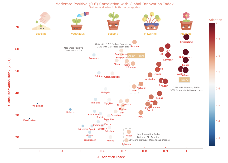
- Switzerland was found the most Innovative Country (on the Global Innovation Index scale), and also as the one with the highest AI Adoption having the most models in production!!
In summary, we observed that adopters of AI continue to have confidence in their capabilities to drive value and advantage, they are realizing the competitive advantage and expect AI-powered transformation to happen for both their organization and industry, ultimately for their country. Those following the adaption approach need to seriously consider shifting to adopting side. By following the right practices and aligning them with current trends, current and future AI adopters can place themselves not just to survive but to flourish in the emerging era of pervasive AI.
From the overall analysis and our research during this analysis, one fact became evident; Beyond the pandemic, the adoption of data science is anticipated to grow both horizontally and vertically. It is likely to move from fast adopters to less tech-focused industries, functions, and geographies in 2022 and onwards. To keep up to date in this period of change and transformations, organizations and leaders need to think of the right strategies to incorporate a data-first culture. While organizations are aware of the importance of adopting this culture, they often fail to approach it from a strategic standpoint. It is important to understand that doing data science to be cool will be disappointing. One needs to have a proper adoption plan along with a purpose.
Our Top Tips on Writing an Effective Data Storytelling Report
- Strong and Unique Theme: The first step is to choose the right theme/topic for the analysis, In analytics competitions, the domain knowledge and the available datasets can provide good directions to choose a theme. For example, in the survey competitions, there are multiple topics to choose from – a gender perspective, age perspective, time series analysis of the trends, geographical insights, etc. A topic that is important and meaningful for the community/audience is highly appreciated. Additionally, an effort should be made in the introduction to really explain why this topic is important and what does this topic mean for the end-user.
- Neat and Clean Plots: Old but important – a picture is worth a thousand words. Indeed the visualizations play a vital role in giving the right and clear messages. One should try to make an effort on creating the plots nicer, simpler, clean, and self-explanatory. One must not also forget the basic elements of plotting – naming conventions, legends, axis titles, and plot titles, etc. Selecting the right color theme is important too to match the overall theme of the analysis.
- Clever Visualizations with Attention to the Detail: Visualizations that are detailed can convey multiple messages. In many cases, 1 plot is enough to deliver multiple insights such as – top takeaways from the plot, a few outliers (top/bottom), the common behavior (mean/central values), different shades/size of the plot elements can convey a numerical measure in a neat fashion. Following is an example from our winning submission –
- Focussed Storyline: It is a good practice to keep the entire storyline of the analysis gripped and centered towards the common topic. There may be multiple parts of the analysis, one should try to avoid deviating from the main topic and stick to the key messaging.
- Consistency in Analysis: One should try to make the entire analysis consistent with a similar color theme throughout the analysis, similar types of plots, and a similar way of content writing with an introduction, general insights, information, and conclusions.
- Insightful Interpretations: A good way to create an impactful takeaway from the analysis is to provide insightful interpretations for every component of the report. This includes explaining or inferring every visualization – highlighting top findings, top insights, or anomalies. And finally, the entire notebook or the report should be made very simpler and easy for the readers to understand.
For more information, check out the full notebook on Kaggle.